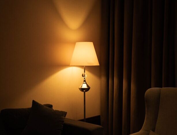

How to Choose Calm Colors for Your Home
Choosing calm colors for your home can make each room feel more comfortable, balanced, and inviting. Soft shades do not have to look plain or boring. With the right combination of color, lighting, texture, and contrast, a peaceful palette can still have plenty of personality.
Whether you are repainting one room or planning a whole-home color scheme, start with how you want the space to feel. Then consider the room’s natural light, existing furniture, and daily use. These simple steps can help you create a home that feels relaxed and connected.
Start With the Mood You Want
Before choosing paint samples, think about the atmosphere you want to create. Calm colors often have gentle, muted qualities, but the best choice depends on the room and your personal preferences.
Consider these common color directions:
- Soft blues can suggest openness, freshness, and quiet.
- Gentle greens can bring a natural, grounded feeling indoors.
- Warm whites can make a space feel clean without appearing cold.
- Light beige and taupe can add warmth and flexibility.
- Muted pinks or clay tones can create a soft, welcoming look.
- Pale grays can provide a simple, modern background.
It can also help to describe the mood with three words, such as “warm, quiet, and natural” or “fresh, airy, and simple.” Use those words to guide your choices and avoid colors that do not fit the feeling you want.
Pay Attention to Natural Light
Light can change the way a color looks throughout the day. A shade that appears warm in a bright room may look cooler in a shaded space. For this reason, do not choose a paint color based only on a small printed card.
Rooms with large south-facing windows often receive strong, warm light. Cool colors may help balance that brightness, while warm shades can make the room feel especially cozy.
North-facing rooms usually receive softer, cooler light. Warm whites, creamy neutrals, and gentle earth tones can help prevent the space from feeling too chilly.
East-facing rooms tend to have bright morning light and softer afternoon light. West-facing rooms often do the opposite, with warmer light later in the day. If possible, view color samples in the morning, afternoon, and evening before making a final decision.
Use Paint Samples Before Committing
Testing a color is one of the most useful steps in the decorating process. Paint a large sample on several walls, or place large sample boards around the room. A small square may not show enough of the color’s undertones.
Observe the samples at different times and under both natural and artificial light. Look at them beside:
- Flooring
- Trim and doors
- Furniture
- Countertops
- Window coverings
- Decorative accessories
A color can appear more yellow, blue, green, or pink depending on what surrounds it. If you are comparing several options, leave space between samples so the colors do not visually blend together.
Choose a Simple Whole-Home Palette
A calm home usually feels more connected when the colors relate to one another. You do not need to use the same shade in every room. Instead, choose a small group of colors that share a similar undertone or level of softness.
A practical palette may include:
One main neutral
Use a soft white, beige, gray, or greige as the foundation for larger areas. This color might appear in hallways, living areas, or open-plan spaces.
One or two supporting colors
Add gentle blue, green, tan, or another muted shade in bedrooms, offices, or smaller rooms. These colors can create variety while keeping the home visually calm.
One accent color
Choose a slightly deeper shade for pillows, artwork, a reading nook, or a single feature wall. An accent color adds interest without taking over the room.
Repeating colors in different areas can make the home feel thoughtfully designed. For example, a soft green in the living room might appear again in artwork or textiles in the bedroom.
Consider Warm and Cool Undertones
Two colors may look similar at first but have very different undertones. A white with a warm yellow or cream base feels different from a white with a cool blue or gray base. The same is true of beige, gray, green, and blue.
Try to keep the undertones of nearby colors compatible. A warm beige may look best with creamy white, natural wood, and warm metals. A cool gray may work better with crisp white, pale blue, and silver details.
This does not mean every color must match perfectly. A little contrast can add depth. However, too many competing undertones may make a room feel unsettled rather than restful.
Use Contrast Carefully
Calm rooms still need contrast so that they do not look flat. Contrast can come from color, texture, shape, or material instead of strong, bright paint.
For example, pair:
- Soft walls with medium-toned wood furniture
- Light upholstery with dark legs or simple metal details
- Pale bedding with a deeper throw blanket
- Warm walls with cool stone or glass accents
- Plain surfaces with woven baskets or textured fabrics
If you prefer a low-contrast look, stay within the same color family and vary the shades. A room with several tones of blue, beige, or green can feel layered while remaining peaceful.
Match Colors to the Room’s Purpose
Think about how each room is used before selecting a color. Bedrooms often benefit from soft, restful shades such as dusty blue, muted green, or warm neutral tones. Living rooms can support a wider range of calm colors, especially when balanced with comfortable textures.
For a home office, choose a shade that feels pleasant for long periods. Soft gray-green, light blue, or warm beige can provide a quiet background without feeling distracting.
Bathrooms often suit fresh whites, pale blue-greens, or light stone colors. In entryways and hallways, a welcoming neutral can create a smooth transition between rooms.
The color does not have to follow a strict rule. Your personal response matters most. If a particular shade helps you feel comfortable, it may be the right choice for your space.
Do Not Forget Ceilings, Trim, and Doors
Walls are not the only surfaces that influence a room’s color balance. A bright white ceiling can create a crisp look, but a softer ceiling color may feel more comfortable in a warm, relaxed space.
Trim and doors can be painted in a coordinating white, a slightly deeper neutral, or the same color as the walls. Using a similar wall and trim color can make a small room feel more spacious. A contrasting trim color can highlight architectural details.
Before painting, compare these surfaces with your flooring and major furniture pieces. A calm palette works best when all the large elements feel connected.
Add Color Through Flexible Details
If you are unsure about using color on the walls, start with items that are easy to replace. Curtains, rugs, pillows, blankets, artwork, and plants can introduce gentle color without a major commitment.
This approach also lets you test how a shade feels in the room. If you enjoy a muted blue throw or green artwork, you may feel more confident using a related paint color later.
Natural materials are especially useful in calm spaces. Wood, cotton, linen, wool, rattan, and stone can add warmth and texture while keeping the overall palette quiet.
Create a Calm Palette That Feels Like Home
The best calm color scheme is one that supports your routines and reflects your taste. Begin with the mood you want, study the room’s lighting, test large samples, and build a palette with related undertones. Then add contrast through texture and carefully selected accents.
A peaceful home does not require a single perfect color. It comes from creating visual balance and choosing shades that make you feel comfortable every day.

Related Posts

Easy DIY Wall Decor Ideas for Every Room